
Client Showcase: LAKE EFFECT LURES
A freshwater tackle brand marketing case study.
3x growth in just 6 months. Dominating the freshwater industry.
What We Did
Facebook & Instagram Ad Management
Google Ads
Email Marketing
Graphic Design
Video Editing
Content production
Partnerships
Competitor Analysis
Branding
Consulting & Strategy
The Challenge:
The Ad Spend Leak: Meta and Google were serving Lake Effect to every "fisherman" in the country; we rebuilt targeting around species and technique so budget went to buyers, not browsers.
The Repeat Buyer Gap: Tackle sells again and again, but only if you ask; we built the email and retention flows that turned first orders into restocks every season.
The Silent Product: A rattle is something you hear and a feed scrolls muted; we produced underwater and on-the-water creative that proved the advantage on screen and gave the ads something real to sell.
The Two-Season Business: Ice and open water pull two different audiences in two short windows; we staged creative, budget, and brand voice ahead of each one so the calendar worked for them instead of against them.

The Mission
Capture market share of the fresh water & hard water tackle space.
We were handed the opposite of the usual problem: a product that already won every time it hit the water, and an audience that had never heard of it. Lake Effect didn't need explaining to anglers on the Great Lakes, it needed to be put in front of everyone else. So we built around proof instead of persuasion, and ran the brand as two seasons under one identity, moving creative and budget ahead of the ice and open water windows instead of chasing them. The result was 3x sales in six months and a catalog that produces twelve months a year instead of spiking twice. This wasn't building a brand from nothing. It was making sure the rest of the country finally found the one that was already working.
Design for Lake Effect Lures
Built for the way anglers actually shop.
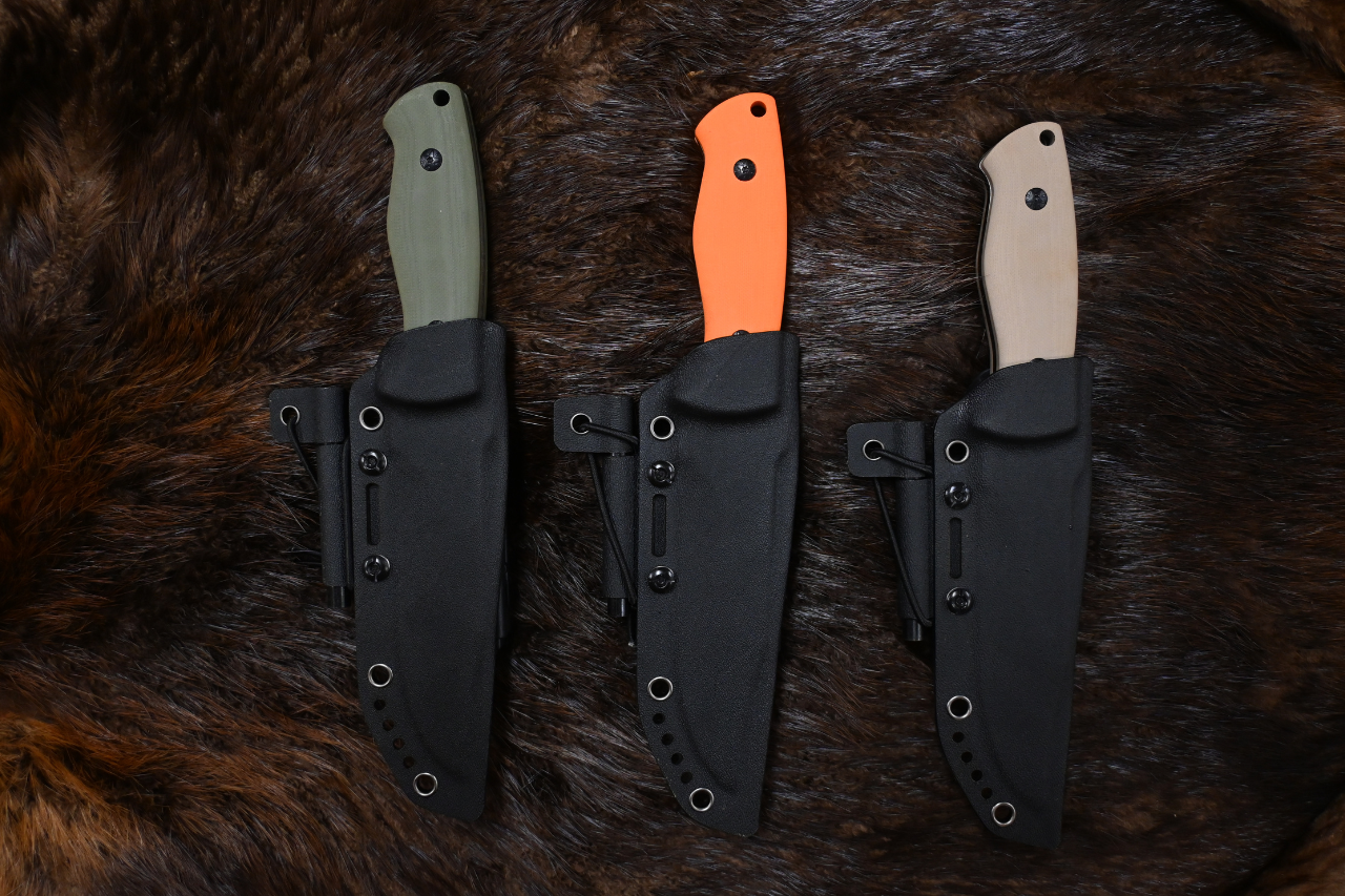
Anglers don't buy "a bait," they buy a size and a color. So we built creative that answered the question already in their head — the full color board, the size comparison from 4" down to the 1.5" Micro, a CTA dropping them exactly where they were headed. Then we gave it rhythm: new drops, new colors, back-in-stock, a steady reason to look so the brand never went quiet between seasons. Same logo, same storm language, same heavy-weather palette on every asset, from the ad to the product page. In a category where everything looks the same, looking like one thing everywhere is what gets you remembered.


Performance Metrics
Capturing market share of the freshwater & ice fishing industry.
Transforming a "tool" into a "desire."
Lifestyle Brand Engineering
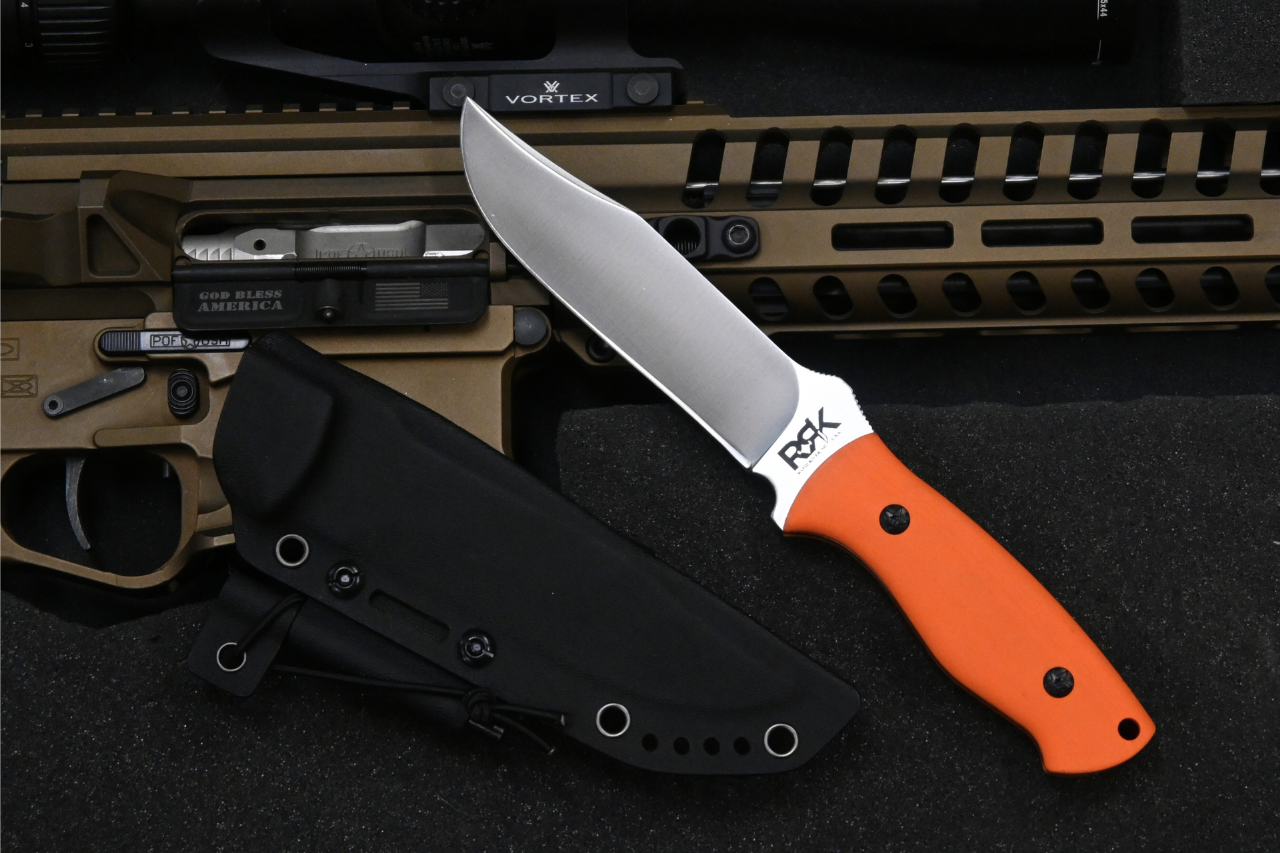
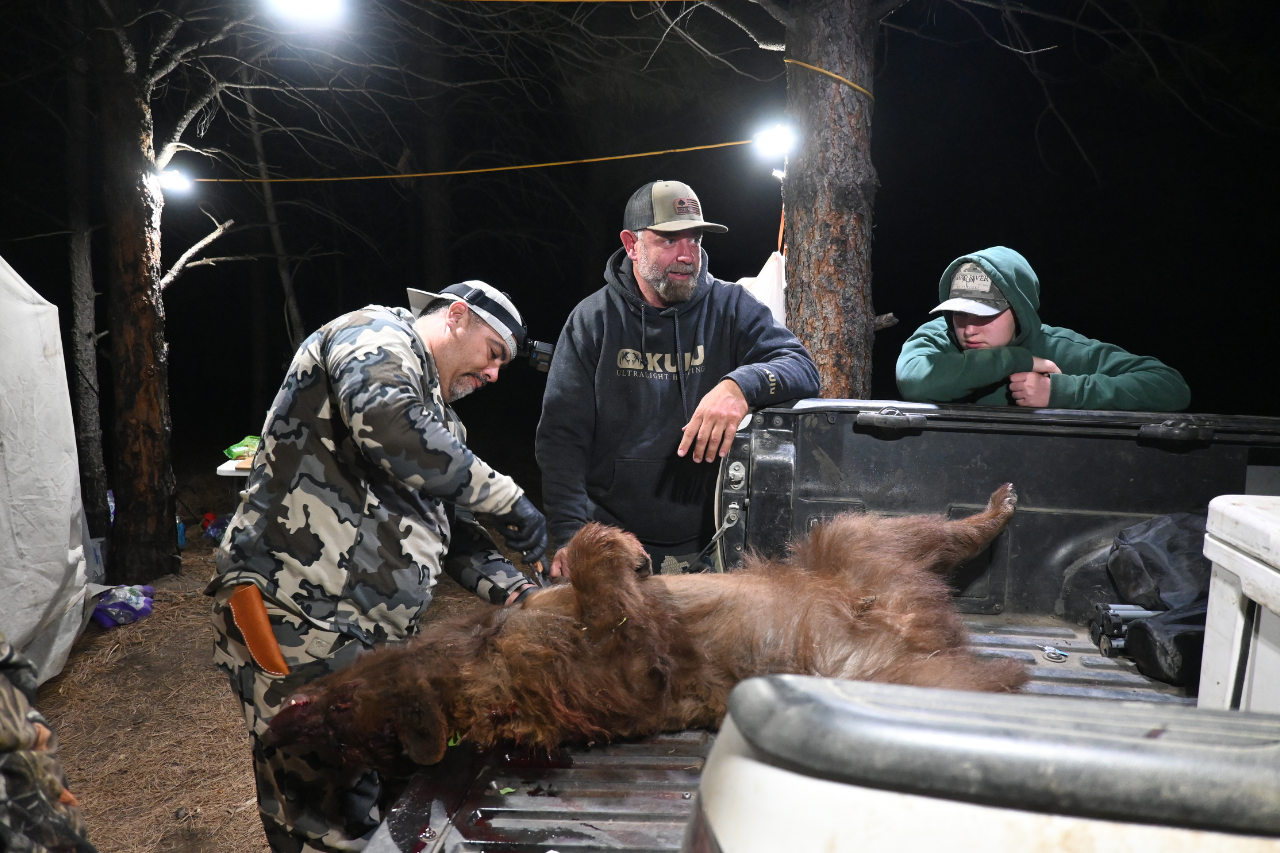
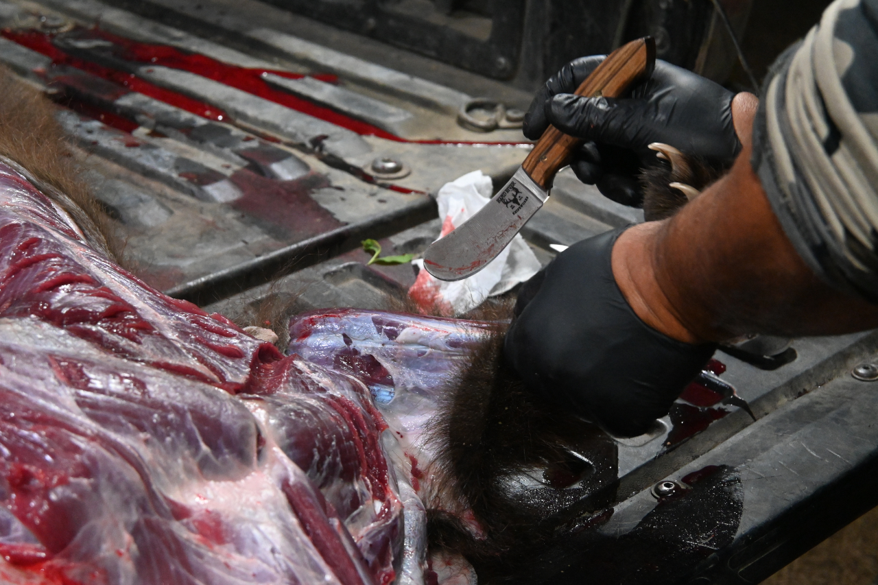
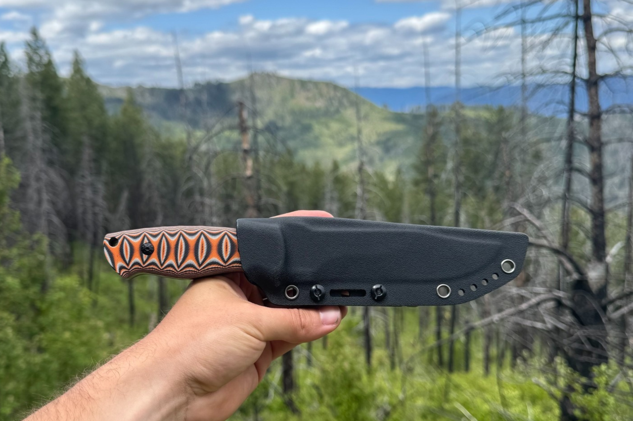
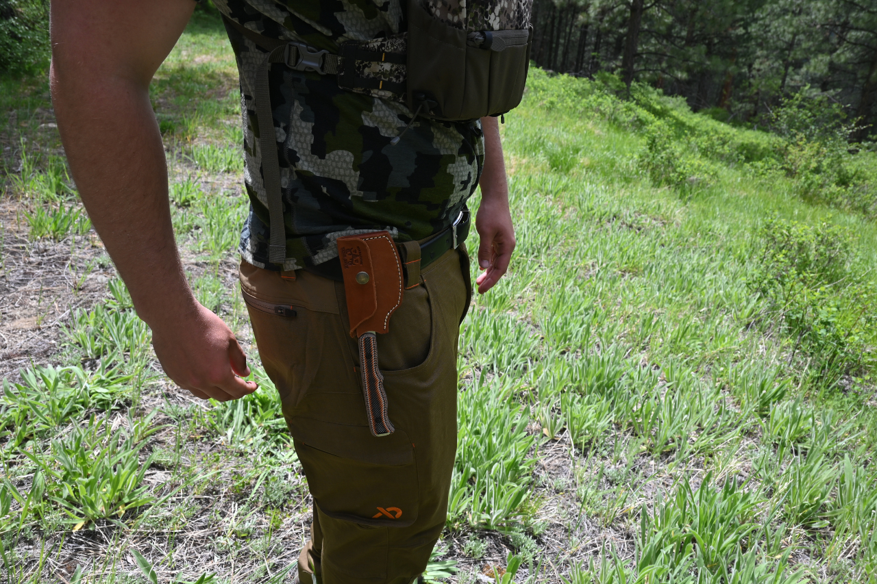
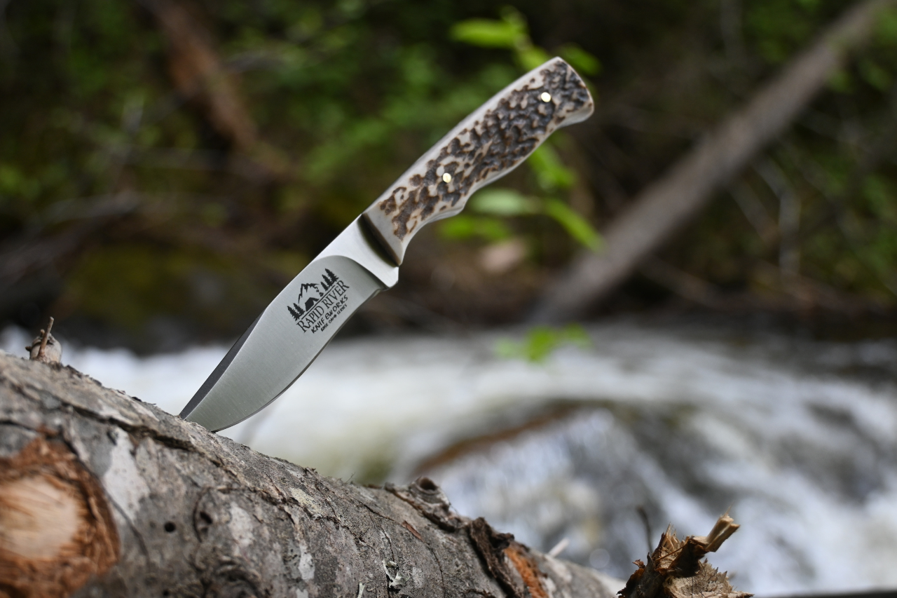
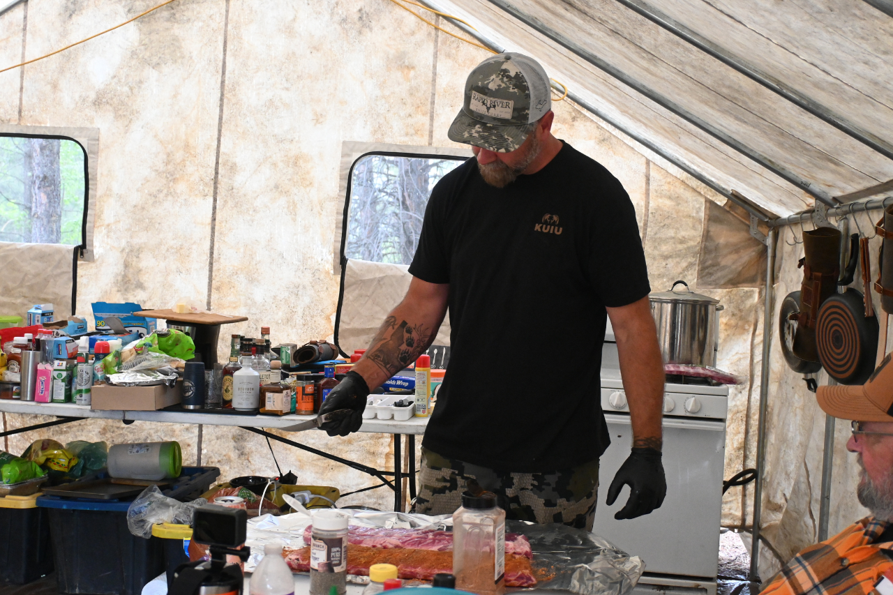
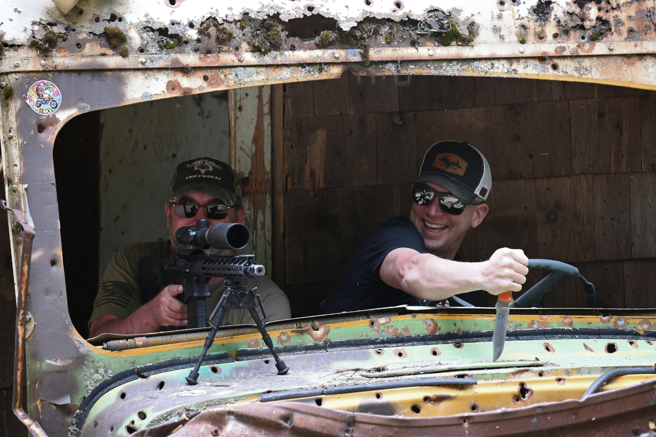
Before we stepped in, the product looked like inventory. We changed the narrative through professional content production. By staging realistic hunting and outdoor scenarios, we elevated the product from a simple tool into an aspirational lifestyle piece. This creates the emotional connection required to sell premium products at a premium price point.
Follow us on social media!
Want to follow us? Click on the icons to follow our journey!


